

 ilovegraphics
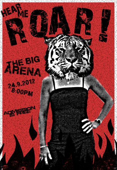
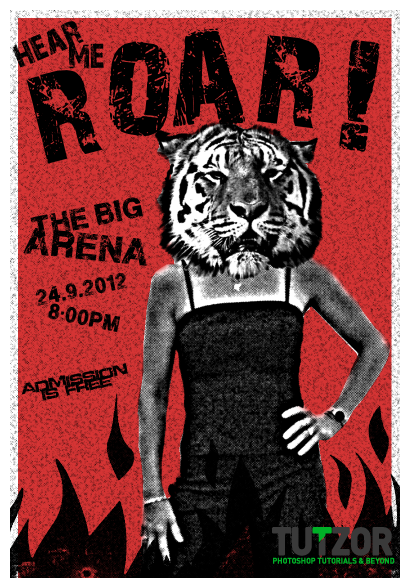
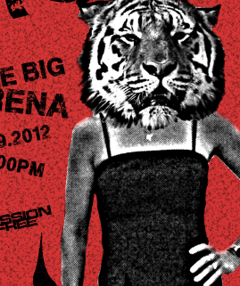
For all of you who want to design a gig poster or brochure that would turn heads, then this tutorial will show you how to do just that. Here we are going to combine several different (perhaps) shocking elements together to come up with a very powerful, textured and retro kind of poster that will surely attract audiences.
 ilovegraphics
 ilovegraphics
 ilovegraphics
 ilovegraphics
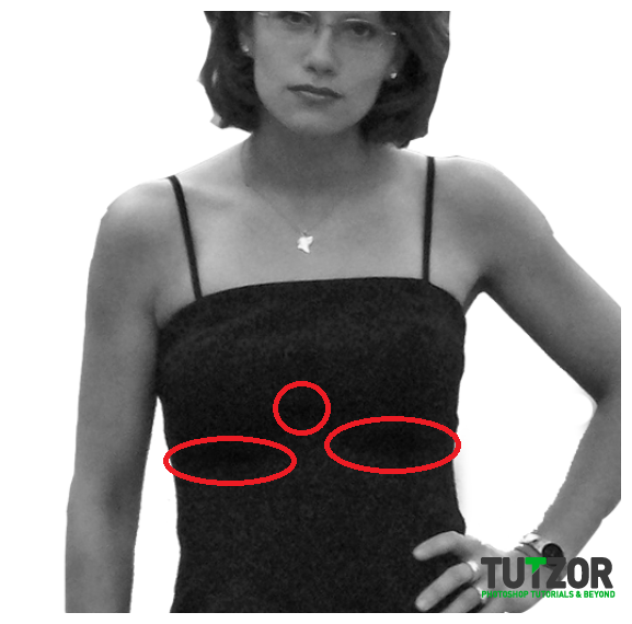 ilovegraphics
 ilovegraphics
 ilovegraphics
 ilovegraphics
 ilovegraphics
 ilovegraphics
 ilovegraphics
 ilovegraphics
 ilovegraphics
 ilovegraphics
 ilovegraphics
 ilovegraphics
 ilovegraphics
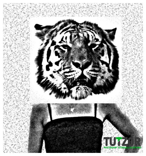 ilovegraphics
 ilovegraphics
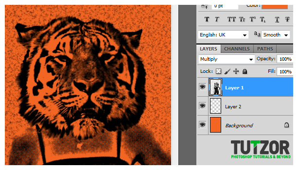 ilovegraphics
 ilovegraphics
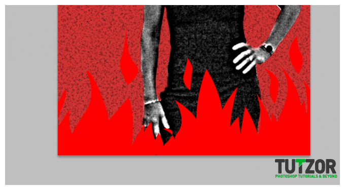 ilovegraphics
 ilovegraphics
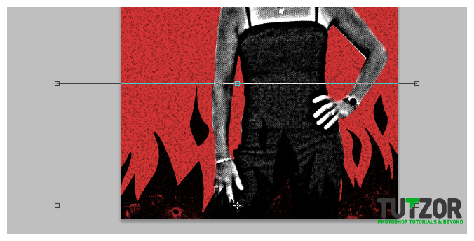 ilovegraphics
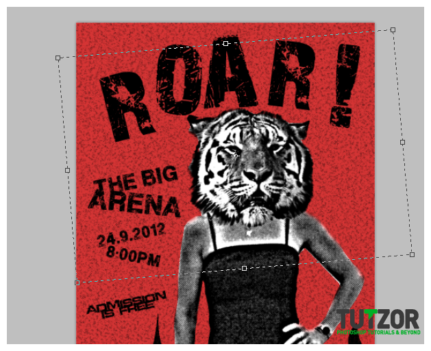 ilovegraphics
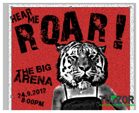
Copyright© 2012 Tutzor All Rights Reserved | Developed by: Iceous Design
