

 Seiorai
Today it's time for opposites collision folks <3
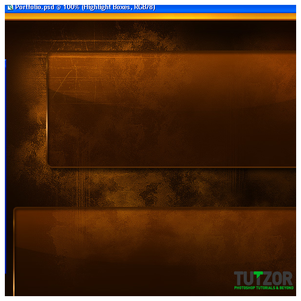
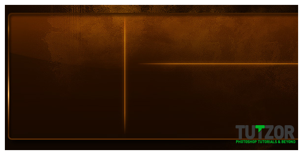
Grunge+Glossy, the eternal battle! xD
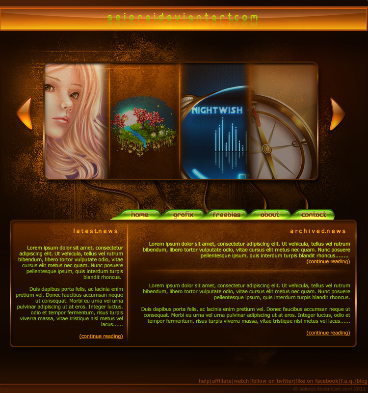
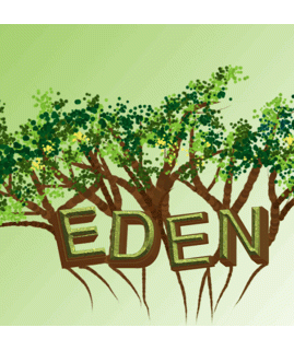
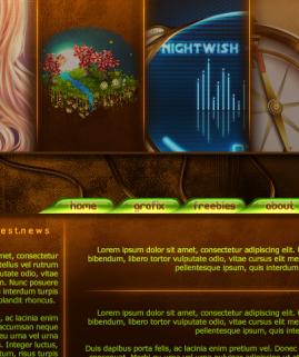
Nice ay? Here's what we'll get in the end, after numerous weeks of hard labour through hot steam and all that:
 Seiorai
 Seiorai
 Seiorai
 Seiorai
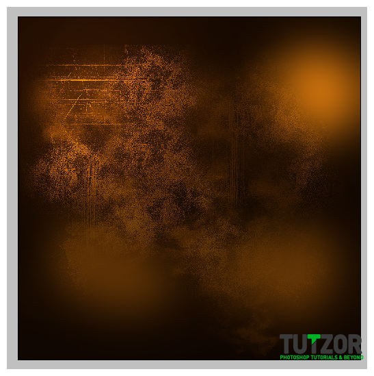 Seiorai
 Seiorai
 Seiorai
 Seiorai
 Seiorai
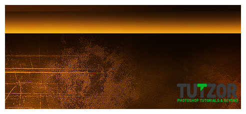 Seiorai
 Seiorai
 Seiorai
 Seiorai
 Seiorai
 Seiorai
 Seiorai
 Seiorai
 Seiorai
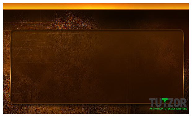 Seiorai
 Seiorai
 Seiorai
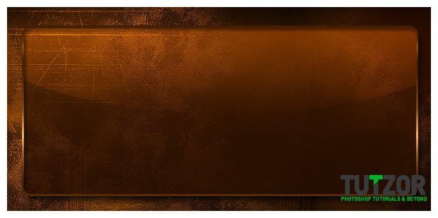
 Seiorai
 Seiorai
 Seiorai
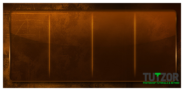
 Seiorai
Copyright© 2012 Tutzor All Rights Reserved | Developed by: Iceous Design


Comments
Re: Grunge Portfolio Layout Tutorial
The gradients which is added to the borders looks awesome ..... gr8 job...
Re: Grunge Portfolio Layout Tutorial
Thank you. This looks amazing.
Re: Grunge Portfolio Layout Tutorial
thanks very