

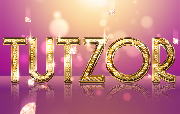
 Seiorai
During one's designer carreer, you hit a time when you come to realize the deep need to......create a bling effect! :D
And if you are reading this you surely have hit that crucial point in your life when you feel that need! ^__~
Let's do it! :)
 Seiorai
Start up Photoshop and create a new document, let's say about 600px width with 380px height....or whatever size you need.
Since Photoshop is nice enough to give us already a starting layer, let's fill it up shall we? :)
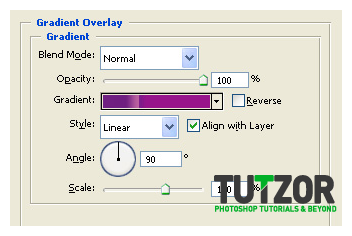
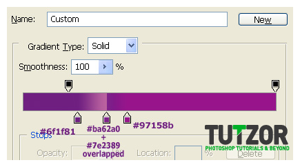
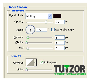
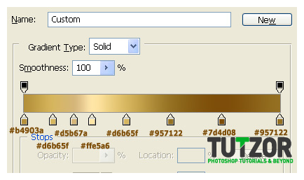
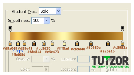
Take the Paint Bucket Tool (G) and fill the layer with...whatever color. Then double-click the layer to get into its blending options, where you'll click on Gradient Overlay and give it these settings:
 Seiorai
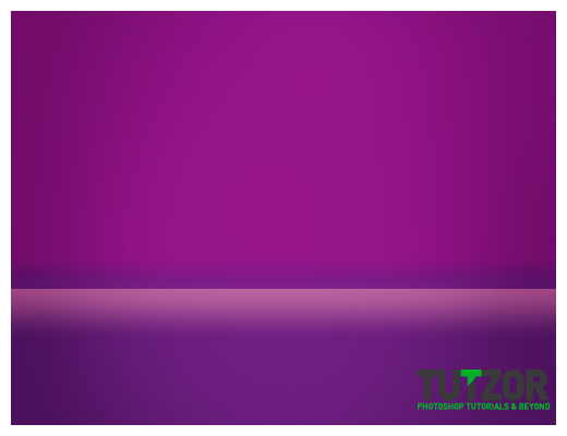
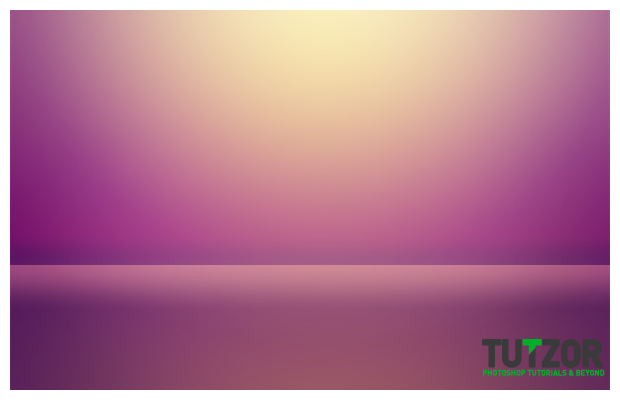
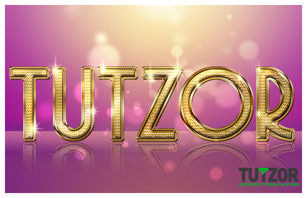
Sweet, now we should have something like in image 1 below--->
But trick is, it looks kind of flat and lifeless you know =/
So here's what trick we'll do: we're going to add gradients to this baby :)
...I mean...MORE gradients hehe...
But first let's do a Hue/Saturation adjustment by going to Layer-->New Adjustment Layer--->Hue/Saturation (or Ctrl/Cmd+U OR that little yin/yang looking icon at the bottom of your alyers palette, your choice) and give it these settings:
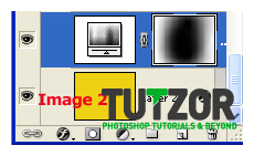
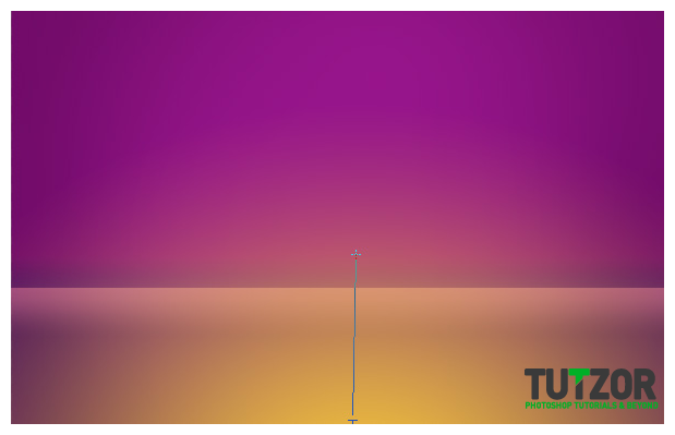
----Then take the Gradient Tool, set your Foreground color to black #000000 and with that Gradient Tool set to Radial Gradient and Foreground to Transparent, drag around the center of the Hue/Saturation adjustment layer so that it looks in your Layers Palette somewhat like below in image 2---->
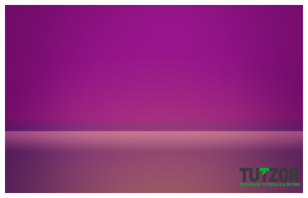
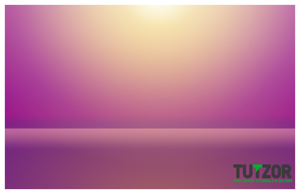
Then set it to Multiply blending mode and lower its Fill to about 50%. Then the thingy should look somewhat like in image 3 below. Notice the darkened areas around the outer parts of the image? ----->

 Seiorai
Okay now let's name that first layer from our Layers Palette "Background". Now we should have one "Background" layer and one Hue/Saturation layer.
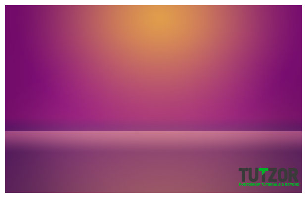
Next, let's create a new layer on top of the other two and name it "Bottom Light". Set your Foreground color to #e3b042 and taking the Gradient Tool set to Radial Gradient and Foreground-to-Transparent, and setting your cursor to the bottom center of the canvas drag upwards like in image 1 below--->
Then lower the layer's Opacity to about 70% and its Fill to about 55% and you should get something like in image 2 below---->
 Seiorai
Riiight....now set your Foreground color to #fdd135 and create a new layer above the Bottom Light one...name this new layer...."Top Light 1".
With the same Gradient Tool as before drag similarly to how we dragged in the previous step....only this time starting from the top center.
Lower the Layer's Opacity to about 70% and you should get something like this:
 Seiorai
Let it be...m0ar light xD
Make a new layer above all your others and name it "Top Light 2". Yea I know, not very creative with the names :P
Setting your Foreground color to #fefbcd take the same Gradient Tool as before and drag again from top center...only this time drag for a liiiittle longer a distance, so you get something like in the image below:
 Seiorai
.....and since it looks really weird to have a diffuse light with no defined light source, set your Foreground color to a lovely #fdfbf2 and create a new layer...above all your others...name it "Top Light Source".
Take the gradient again, place your cursor in the top-center and drag for only a little distance, so you get somehting like in the image below. Notice the tiny light source at the top center?
 Seiorai
Coolio! We're done with the background =D
Now if you want you can use that awesome feature Photoshop has and you can Group all these layers into one larger group...call the group "Background".
Okay, m00-vin' on.
Now we'll do the bling-bling itself ^^
Now, here's a tip: for the bling-bling, the wider the text is the better. Narrow text....tsktsk...not so good.
Alright, so. Here I'll be using the lovely font "Copasetic", which you can download here: http://www.dafont.com/copasetic.font
Well, create a new layer above everything else you have now in your Layers Palette and set your Foreground color to #d4ad74
....we're changing colors a lot here aren't we xD
Right!
Once you set your Foreground to that desaturated yellow, take the Text Tool (T) and ..well...type? xD
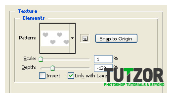
Then download this pattern here... http://fav.me/d3958wq ...yes it's hearts pattern what? It does the job >__o
...and load it to your Photoshop.
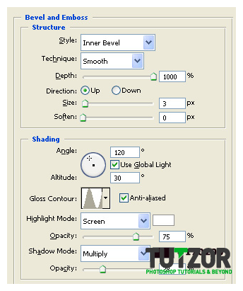
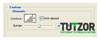
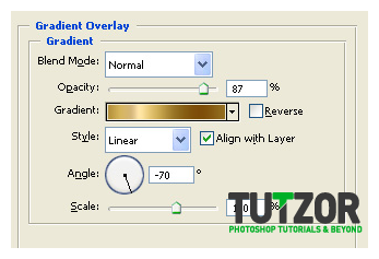
Then go to that text layer you made and give it these layer styles below:
 Seiorai
Pffft...those were A LOT of layer styles >.>;
Okay now your stuffie should look something like this:
 Seiorai
Right...Now create a new layer and move it right under your Text layer.
Name it "Text Gold Border".
It doesn't look like moch now but patience: we'll bling it out in a sec :)
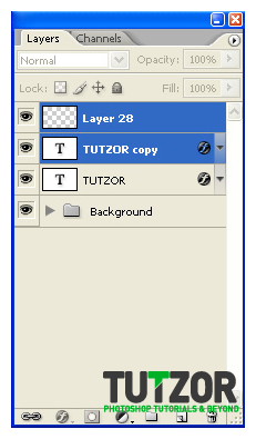
Mmkay, now duplicate this text layer, so that you have two copies of the text. Create a new layer on top of the copy of the text layer...and Ctrl(Cmd on Mac)+click on BOTH the copy AND the newly created blank layer so you get them both in a blue color like in the first image below---->
Sweeet :)
Now once you have them selected like that press Ctrl(Cmd)+E to merge these two together and like this get rid of the text layer's styles while managing to keep it's "looks" :)
Name this layer "Sharpened Text". Then go to Filter--->Sharpen--->Sharpen and lower the layer's Opacity to about 60% after that ^^
You should get a nice diamond-y effect like in image 2 below---->
 Seiorai
So...now you can do the same Ctrl(Cmd)+click on the "Sharpened Text" and the text itself layers and merge these two babies together so that we get a nice final rasterized&sharpened layer....name it "Final Text Layer"
Next it's time to burn it...and dodge it...:)
So. Take the Dodge Tool (O) and set it to a soft, round brush of about 60px in size, Range: Highlights and Exposure: about 10%. NO Airbrush by the way.
...and start dodging the bullets....xD
I mean, dodging the text. Make sure not to over-dodge, just try to define a light source you know? Where light hits hardest the color will be more towards white.
Then after you are done with the Dodge take the Burn Tool, again a soft round brush of about 60px, set to Range: Shadows and Exposure about 10% again, NO Airbrush......and burn around the parts opposite to the places we dodged earlier.
Pffft, after so much dodging&burning we are tired.....but looking at our result we are pleased to see...something like this....:
 Seiorai
Phew, got that sorted out :)
Now let's take care of that infamous golden border ^^
Right, so. Create a new layer and move it right under your "Final Text Layer" one.
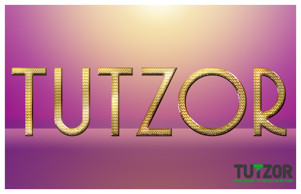
Make sure your Foreground color is set to #d4ad74 and then press Ctrl(Cmd on Mac)+click on the "Final Text Layer"'s layer thumbnail in the Layers Palette so you obtain its selection, like in the image 1 below---->
Then go to Edit--->Stroke--->5px--->Outside.
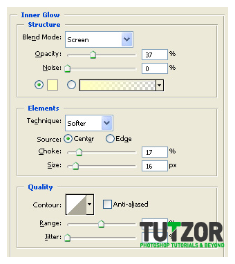
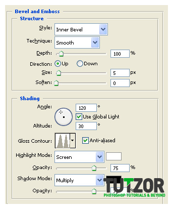
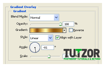
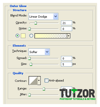
The give it the layer styles in images 2, 3 and 4 below:
 Seiorai
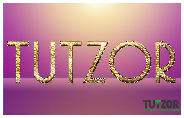
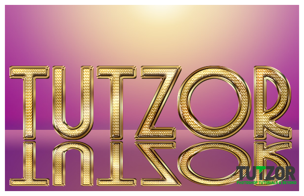
Nice! Now your thingy should look somewhat like in image 1 below--->
Okay, then Ctrl+click on the "Final Text Layer"'s thumbnail in the layers palette....to get its selection. After you've done that Ctrl(Cmd)+Shift+click on the "Gold Border"'s thumbnail...yes! Now we have both selected into one...huuuge-tastic...selection :)
Like in image 2 below:
 Seiorai
Mmkay now give this selection a Brightness/Contrast adjustment layer...with Brightness:+15 and Contrast: +5. Nice :)
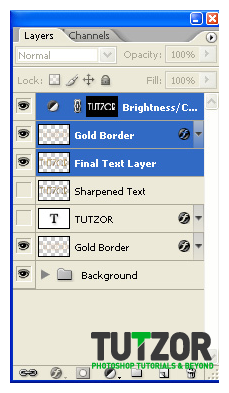
Okay, now what we'll do is use that Ctrl(Cmd)+click on layers method to get the "Final Text Layer", the "Gold Border" and the Brightness/Contrast adjustment layer we just created selected in the layers palette in a dark blue color...like in the image below:
 Seiorai
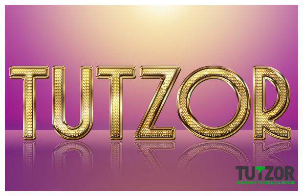
After that press Ctrl(Cmd)+E to merge these little buggers into one single layer...then go to Edit--->Transfore--->Flip Vertically. Name the layer "Text Reflection" and using the Move Tool (V) move it so that its top is only a few pixels away from the original text's bottom...like in the image below:
 Seiorai
Next let's click Ctrl(md)+T to transform it by squeezing vertically...so that after this our layer looks weirdly flattened like in image 1 below---->
Right.
Now go to Filter-->Sharpen-->Sharpen and give it nice ..sharpen...because the vertical resizing kind of blurred it and we don't want that do we? Oh and let's name this layer "Reflection" while we're at it.
Next lower the layer's opacity to about 45% and then go to Layer--->Layer Mask--->Reveal All. Make SURE you have the mask selected and NOT the layer's thumbnail (this is important!) and setting your Foreground color to #000000 take the Gradient Tool (G) and set it to Foreground-to-Transparent.
Then drag from the bottom upwards so that you get a result similar to image 2 below:
 Seiorai
Next it's time for the sparklysparkle xD
Take your favorite sparkles brush..for example this one http://fav.me/d2y09xk and setting your foreground color to #ffffd2 brush around here&there some nice little sparklies :)
Then name this layer "Sparkles" (Duh!) and give them this layer style below:
 Seiorai
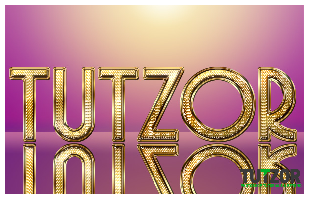
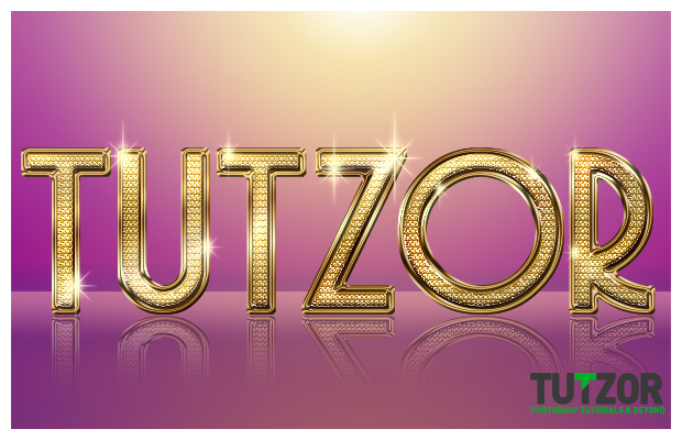
Okaaaay, now you should have something like in image 1 below----->
Next let's warm the mood up a little by using a Hue/Saturation adjustment layer set to:
Make sure this adjustment layer is on top of all your others by the way!
Kay next, create a new layer, yeeees, on top..of all you others...and name it "Bokeh 1". Take your faaave bokeh brush, set your Foreground color to #fcf9ea and bokeh it up a bit ^^
Then set the layer mode to Color Dodge and lower its Fill to about 30%.
Okay...next for a more subtle effect, set your Foreground color to #e1af7d and creating a new layer above aaaaall your others take the bokeh thingy again and brush a bit (this works especially well in shadowy areas). Set this layer to Color Dodge and lower Fill to about 50%...and name the layer "Bokeh 2".
You'll get something like in image 2 below:
 Seiorai
Okay, now what you need to do is head over to this awesome tutorial over here: http://fav.me/d2ae5ft
I suggest you use very light pink tones, so that you get the proper effect.
Create a diamond exactly like that and pen it up in your blingy .PSD file. Make sure it is placed on a layer on top of all your others.
Good..now we'll just name the layer "Diamond". Then duplicate it 6-7 times. With these duplicates we will change size and orientation by resizing and/or flipping horizontally, so we create the impression of depth of field and randomness.
Just resize and/or flip each of them a bit and place them randomly around the canvas...something like this:
 Seiorai
Next, we'll use the Sharpen Tool (O) set to a soft, round brush about 60px in size, Mode: Normal, Strength: 25%....and sharpen these babies juuust a tiny bit.
We're not using the Filter sharpen because that gives weird results >.>; So grab that tool and get to work! xD
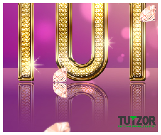
Next take the Blur Tool and set it to a fort, round brush of about 100px in size, Mode: Normal and Strenght: 30%...and blur the largest&closest...see there in my image that is the bottom-left one...so that we give the impression it is very close to the camera and thus slightly out of focus.
Do the same to the tiniest and farthest diamond (in my image that is the small one on the floor, behind the "O" and the "R" letters).
Good. Next thing we'll do is duplicate each diamond layer THAT TOUCHES THE "FLOOR"!
Make sure you only do the following actions on the diamonds which touch the floor not on those in mid-air too.
Like I said, duplicate each floor-touching diamond and on each do the following:
----------flip the layer vertically by using Edit--->Transform--->Flip Vertically.
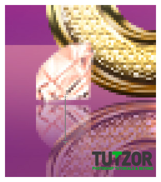
----------move the flipped copy down..like we did for the Bling Text reflection remember? Move it down so that it is only one or two pixels below the main diamond, like in the image below---->
 Seiorai
Then...:
----------go to Layer--->Layer Mask--->Reveal All.
----------take the Gradient Tool (G), set it to Foreground-to-transparent and Linear Gradient, and make sure your Foreground color is set to #000000 ...aka plain..old..black xD
Then drag from the bottom of the copy towards its top...like in image 1 below..and lower the layer's opacity to about 75% ---->
...so that you get something like the image 2 below:
 Seiorai
Next we will merge all the Diamond copies (not the reflection ones, only the main diamonds layers) into one layer by using the Ctrl(Cmd)+E method.
Then duplicate the resulting layer and name it "Diamonds-motion blur". Go to Filter--->Blur--->Motion Blur, and give it an angle of 90 degrees and a distance of about 40.
Then click OK and move the resulting motion blurred layer upwards a bit, so that the motion blur is only visible above the diamonds...you know..like..well..an in-motion blur..haha ..^^;
Like...hmm..you wouldn't see a motion blur UNDER the falling object, just only above it see?
Then move this motion blur layer under the actual "Diamonds" layer.
Like in image 1 below---->
Then lower the Fill to about 25% and set the blending mode to Linear Dodge. Optionally now you can take that favorite Sparkles brush of yours again and on a new layer above all the rest ..give some sparkles to your diamonds too, not only the text itself.
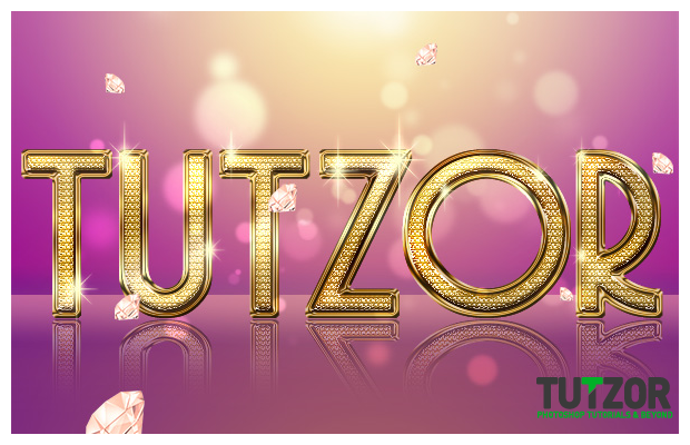
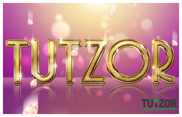
So..ladies and gentlemen, look below at image 2 to see our final result of Bling-Doom hehe :)
I hope you liked the tut ^^ Not as long as my usual ones but I think this is a beautiful effect and hopefully some will put it to good use ^__~
Any trouble you come across, or if you want to show me your final results, you can always reach me via my DeviantArt account at http://seiorai.deviantart.com/ or on my Facebook page: http://www.facebook.com/profile.php?id=100001907117980
See ya :)
Copyright© 2012 Tutzor All Rights Reserved | Developed by: Iceous Design

Comments
Re: Realistic Fancy Bling Effect
Im having trouble applying the layer effects to the stoke (gold border) im messing something up because i cant make the stroke its own slection...Help!
Re: Realistic Fancy Bling Effect
ありがとう!!
Bling Typography
Glamorous and elegant. Gold and diamonds. Love the bling. This is a nice typography effect. Thank you for sharing this.
Re: Realistic Fancy Bling Effect
so glamour and cool
like it :)
Web Designer
Nice and very elegant. Awesome work!
Re: Realistic Fancy Bling Effect
This is really a cool effect. Glamour effect at it's best
Re: Realistic Fancy Bling Effect
Alice, I really enjoyed your tutorial and other ones i've been seeing all this while... remain bless!
Re: Realistic Fancy Bling Effect
Hi!
I love your tutorials! Keep up the good work!
Re: Realistic Fancy Bling Effect
Excellent, Detail, very nicely explain tutorial. I like your wonderful output.
Thanks so much for posting it you make Photoshop more interesting & Enjoyable
keep up good work
God Bless you :)
Re: Realistic Fancy Bling Effect
Thanks for your support! We try to bring new and fresh tutorial every week. :)
Stay tuned!
Re: Realistic Fancy Bling Effect
Thanks for sharing this experience i just love the stuff and tutorial here.