

 ilovegraphics
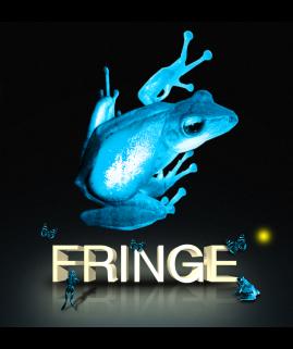
We are going to show you here how to make a very creative kind of dreamlike and “Eco” styled 3D text. We will be using a combination of Adobe Illustrator and Adobe Photoshop to achieve this.
 ilovegraphics
 ilovegraphics
 ilovegraphics
 ilovegraphics
 ilovegraphics
 ilovegraphics ilovegraphics
 ilovegraphics
 ilovegraphics
 ilovegraphics
 ilovegraphics
 ilovegraphics
 ilovegraphics
 ilovegraphics
 ilovegraphics
 ilovegraphics
 ilovegraphics
 ilovegraphics ilovegraphics
 ilovegraphics
 ilovegraphics ilovegraphics
 ilovegraphics
 ilovegraphics
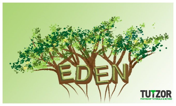
Copyright© 2012 Tutzor All Rights Reserved | Developed by: Iceous Design


