

 Cpotorac
Here is a new and improved look of the Tutzor website. Also you should learn a lot from this tutorial.
Now it's time to do your own website layout. Don't forget to read about various webhosting types and providers so you'll know which one will work perfectly for your website. Enjoy!
 Cpotorac
 Cpotorac
 Cpotorac
 Cpotorac
 Cpotorac
 Cpotorac
 Cpotorac
 Cpotorac
 Cpotorac
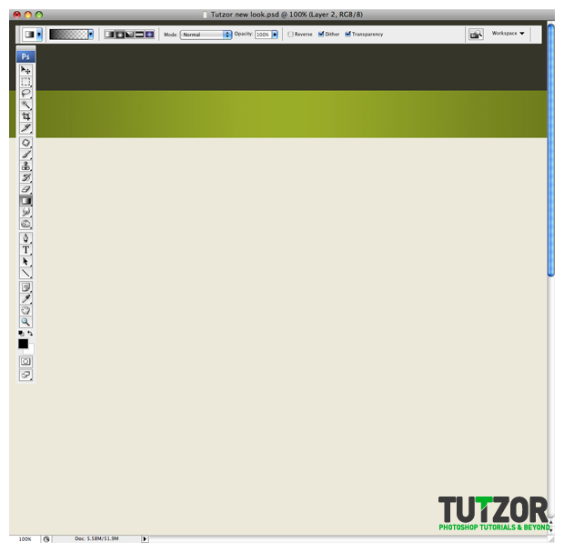 Cpotorac
 Cpotorac
 Cpotorac
 Cpotorac
 Cpotorac
 Cpotorac
 Cpotorac
 Cpotorac
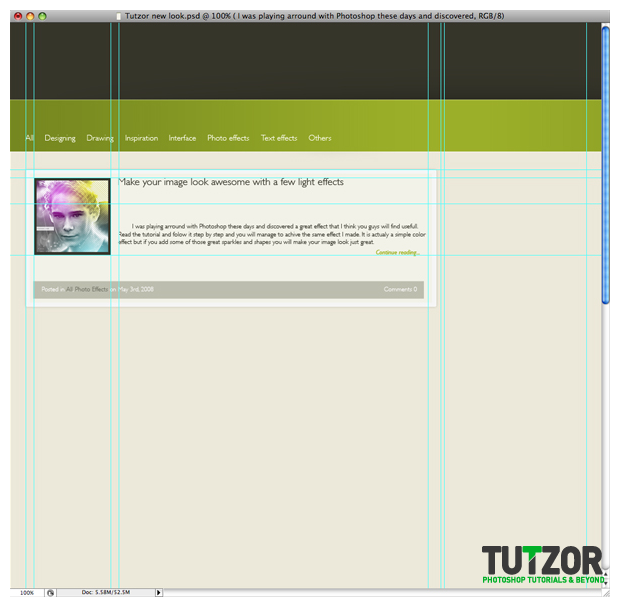 Cpotorac
 Cpotorac
 Cpotorac
 Cpotorac
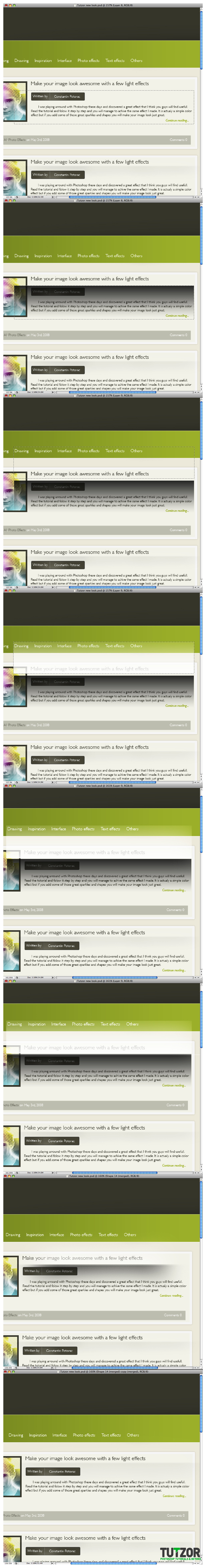 Cpotorac
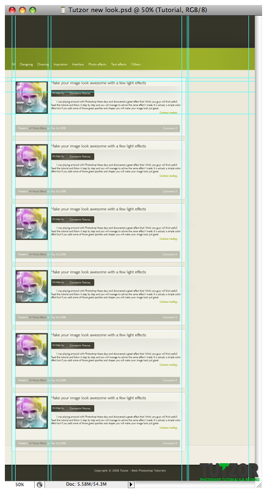 Cpotorac
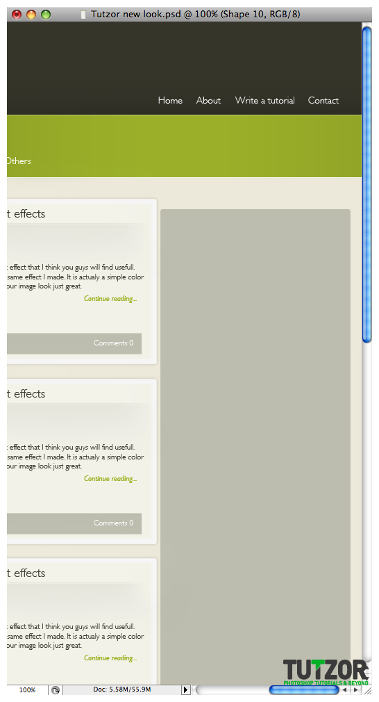 Cpotorac
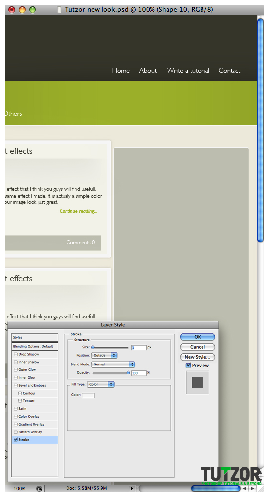 Cpotorac
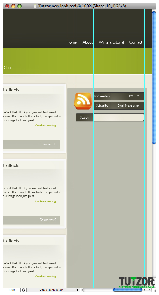
Copyright© 2012 Tutzor All Rights Reserved | Developed by: Iceous Design


Comments
Re: Tutzor web 2.0 style design - PART 1
this is a great tutorial ive really find it easy to understand this
Re: Tutzor web 2.0 style design - PART 1
Excellent Tutorial that gives you amazing creative work for your websites.
web design company
Thanks for u r information
its very useful..........