

 Seiorai
Okay boys&girls, today we'll go back to those awesome days when Star Wars movies first hit the big screens and everyone instantly went into a hype about this new, weird, awesome kind of movies! Remember those days? Oh..you don't....well let's shake hands then, I don't remember them either ^_~
But I've read enough and seen enough old footage on TV to be able to imagine it :)
So yeah. Today we'll take a ride in the Star Wars universe!
We'll do this by creating our own media player interface design -just the design folks, I'm no good at coding this kind of stuff hahaha- greatly inspired by the awesome C-3PO :)
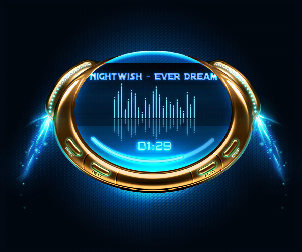
Long story short, this is the final result:
 Seiorai
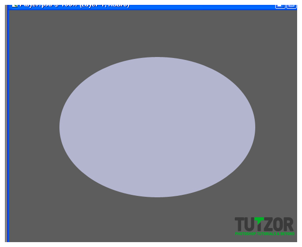
Okay, first let us fire up Photoshop and create a new document, say about 600px wide and 500px tall. Take the Paint Bucket Tool (G) and fill it with a neutral gray...say #5d5d5d.
Now name this neutral gray layer..."Background". Yeah I know, veeeery original...
Anyway. Name it "Background" and then create a new layer above it. Set your Foreground color to #b3b5cf and taking the Ellipse Tool, set it to Fill Pixels mode and on the new layer we just created draw an ellipse like so:
 Seiorai
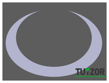
Now take the Elliptical Marquee Tool (M) and drag to create an elliptical selection. Make sure the selection is centered, so that the right side is symmetrical to the left side....then press Delete. You should be getting a result similar to this:
 Seiorai
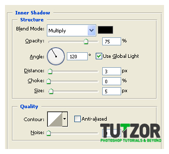
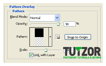
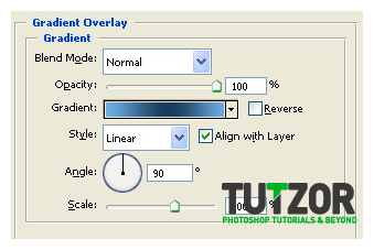
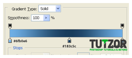
Deselect.< br/> Nice...well not really :P < br/> Let's give our plain, boooring semiluna some layer styles, shall we? < br/> So, get into the layer's Blending Options and give it these styles:
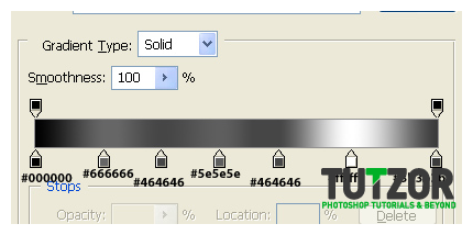 Seiorai
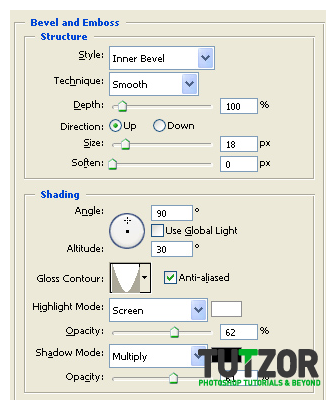
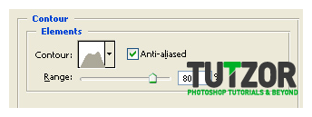
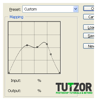
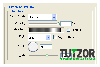
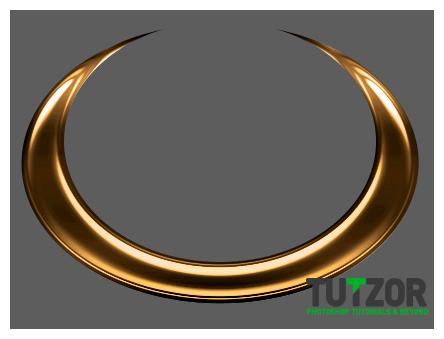
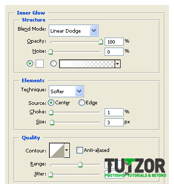
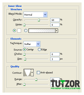
Now, fasten your seatbelts: we are going to give our metal-ly semiluna A LOT of adjustment layers (to be exact, 9). So....have that seatbelt tightened up well? Let's proceed.......
Now if you want you can use Photoshop's awesome Groups feature to group all these Body Player related layers into one laaarge Group.....which we'll name "Body Player Group"...for the sake of convenience haha :)
Right now your thingy should look somewhat like this:
 Seiorai
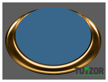 Seiorai
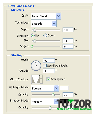
 Seiorai
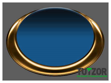 Seiorai
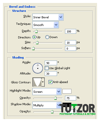
 Seiorai
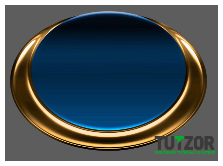 Seiorai
 Seiorai
 Seiorai
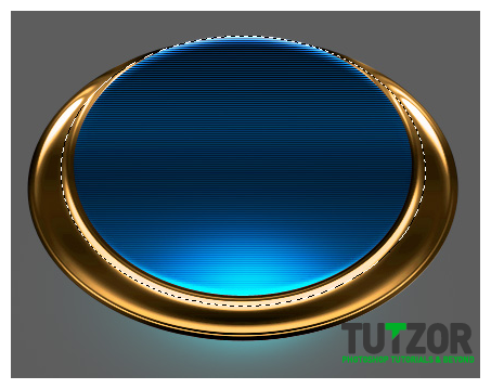 Seiorai
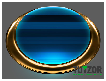 Seiorai
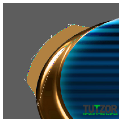 Seiorai
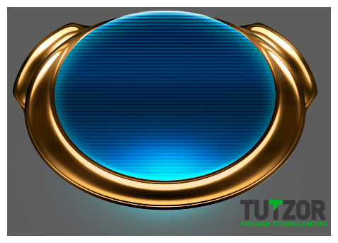 Seiorai
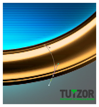 Seiorai
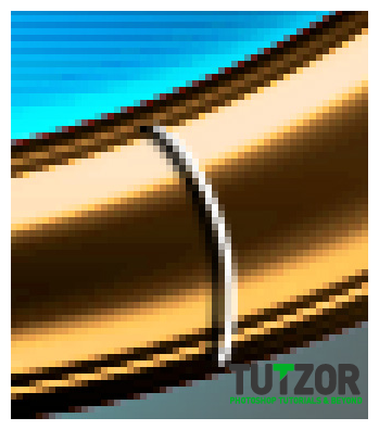 Seiorai
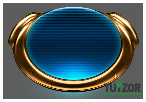 Seiorai
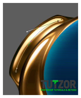 Seiorai
 Seiorai
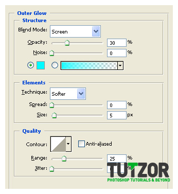
 Seiorai
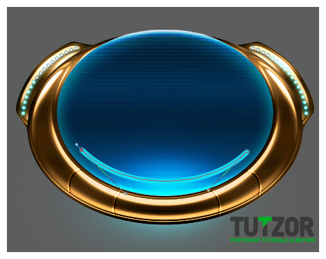 Seiorai
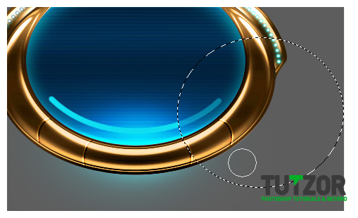 Seiorai
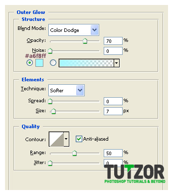
 Seiorai
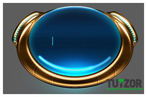
Copyright© 2012 Tutzor All Rights Reserved | Developed by: Iceous Design


Comments
Re: Create a Star Wars Themed Media Player
Can you please make the Tutzor logo 50% transparency or make a note of the options it's blocking please?
Re: Create a Star Wars Themed Media Player
It can be used. There are Photoshop website templates with login modules, etc. that have to be spliced. Then, they are imported into Dreamweaver, where you can use HTML and CSS to code them. But, depending on your coding experience, that may be over the top.
Re: Create a Star Wars Themed Media Player
hello
nice logo but i cant make :(
do you have video for this logo
thankyou
Good tutoiral
Good tutorial Good tutorial Good
Re: Create a Star Wars Themed Media Player
You know sei, it would be super cool if the stuff you made could actually be used. Like this. It would be awesome if it would be an actual player. I'd use it all the dang time @___@